The Fuel Gauge
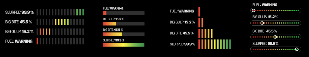
The initial direction from the director was to create a heads-up display oriented toward c-store products. In the images below, you can see the first explorations of that approach before we ultimately shifted toward a cleaner, more streamlined design.

During the process, the team also raised a long-standing goal: creating a dedicated icon set for Speedway, similar to 7-Eleven’s but distinct to the brand. I developed a set that felt authentic to Speedway’s identity, and while the icons resonated, we realized the proprietary beverage brands themselves weren’t standing out enough in the commercial context.
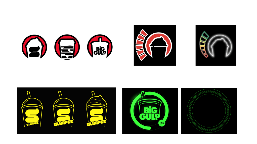
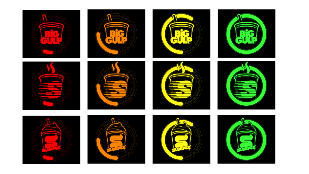
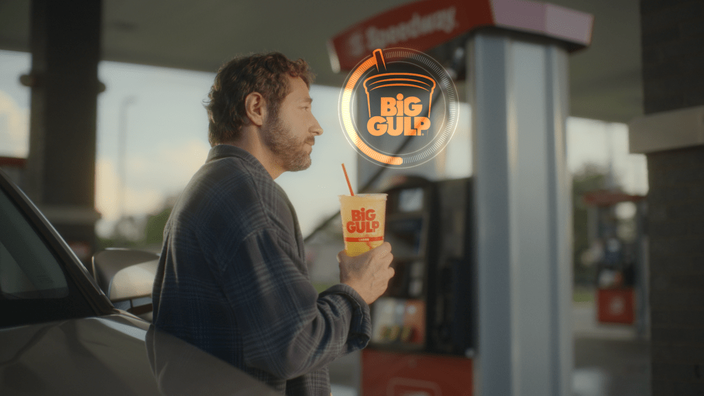
To solve this, we experimented with scaling up the brand names and letting the cups break the boundaries of their circles for added emphasis. The final round of revisions brought everything together—just 24 hours before the commercial shoot. In that last pass, I added a subtle tick-mark ring to anchor the gauge and removed the numbers for a more simplified, focused look. The result was a design that felt confident, balanced, and true to the brand.


Employer: 7-Eleven
Project: Fuel Up with Speedway
Commerical Director: Jerod Couch
Team: Heather Chong, Dustin Hall, Emily Stites, Kayla Smith
